
At some point while planning your horse photography session, this thought sneaks in: “Wait… what colors am I supposed to wear with my horse?”
And suddenly you’re trying to coordinate with a 1,200-pound animal who did not offer input.
If you’re anywhere around Chattanooga, Knoxville, Ooltewah, or across East Tennessee and North Georgia, you’ve probably seen photos where everything just works… and others where something feels a little off, even if you can’t quite explain why.
A lot of that comes down to color. But here’s the good news.
You don’t need to know color theory. You don’t need a perfectly curated wardrobe. You just need to understand one simple idea.
If you’re still in the early planning stages for a portrait session, you can start here with the Ultimate Guide to Horse Photography in Chattanooga
You’re Not Matching… You’re Complementing
This is where most people get tripped up. A lot of people try to match their horse.
Chestnut horse? Wear brown.
Grey horse? Wear grey.
Black horse? Wear black.
And technically… you can do that.
But visually, it flattens everything.
You and your horse start to blend together instead of standing apart. The image loses depth. Your eye doesn’t know where to land.
Complementing is different.
It creates separation. It lets your horse stand out while still feeling connected to you. It gives the image shape instead of turning it into one solid block of color.
We’re not trying to disappear into the horse.
We’re trying to stand next to them in a way that feels intentional.
What Most People Want To Know
Choose colors that complement your horse, not match them.
Neutrals and earth tones tend to work beautifully across most situations. A little contrast helps your horse stand out, while overly bright or busy colors tend to pull attention in the wrong direction.
That’s the foundation.
Everything else is just refining it.
Colors That Work Almost Every Time
If you want the easiest starting point, go here.
Soft neutrals and earth tones.
Cream. Beige. Soft gray. Olive. Muted blues. Warm, dusty tones that feel like they belong outside instead of in a highlighter set.
These colors tend to work well whether you’re in a field outside Cleveland, TN, tucked into a barn in Ooltewah, or shooting somewhere scenic out toward Lookout Mountain or North Georgia.
They don’t fight the environment. They don’t compete with your horse.
They just support everything else.
And that’s exactly what you want.
What Works with Different Horse Colors
This is where we refine things a bit… without turning it into a rigid rulebook.
Bay and Brown Horses
These horses already carry a lot of warmth in their coats.
Soft neutrals and slightly warm tones tend to work beautifully here. Think creams, tans, soft greens, and muted blues.
What you want to avoid is blending too closely into the same exact tone. If everything is the same shade of brown, the image can start to feel a little heavy.
A little contrast keeps things balanced.
Black Horses
Black horses naturally create strong contrast, which is a gift in photos.
Lighter tones tend to pop nicely against them. Light neutrals, and even some richer tones, like jewel tones, can work really well.
You can also lean into deeper, more dramatic colors if that fits your style… just be careful not to go so dark that everything blends together again.
With black horses, it’s all about letting them stand out without overwhelming the frame.
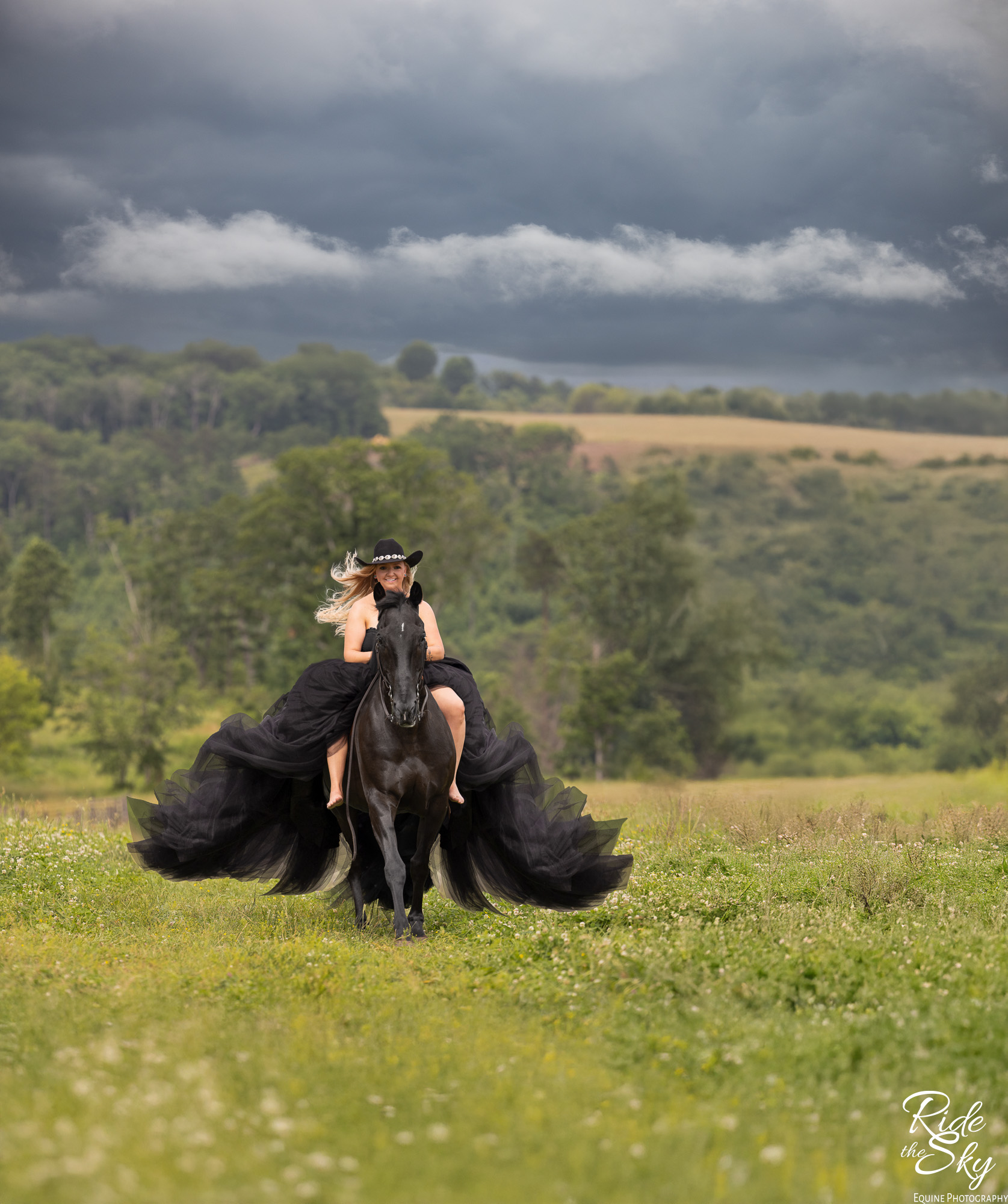
That being said, handled correctly, a black dress can look amazing with a black horse in the right circumstances. For example, this image below. We were blessed with a dark and stormy day to really make it work.
Grey, Creamellos, and Light Palominos
Grey horses can be a little trickier, because they’re already so light. If you go too light with your outfit, everything starts to wash out.
Instead, slightly deeper tones help ground the image. Soft blues, deep pinks, muted greens, even some darker neutrals can create just enough contrast to keep things interesting without feeling heavy.
You don’t need to go bold. Just avoid disappearing into the same brightness as your horse.
Chestnut Horses
Chestnuts bring a lot of warmth… sometimes a lot of warmth. Cooler tones are your friend here.
Soft blues, sage greens, and more neutral shades help balance that warmth instead of competing with it.
If you lean too heavily into similar warm tones, things can start to feel a little intense.
A bit of contrast brings everything back into balance.
The Environment Still Gets a Vote
Even if you pick the perfect color for your horse… the environment can shift how it all feels.
A soft, natural outfit works beautifully in an open field or a relaxed barn setting.
A more structured or dramatic look might need a more intentional background to support it.
Everything is connected.
Your outfit, your horse, and your location all work together to create the final image. If one piece feels out of place, your eye will pick up on it… even if you can’t explain why.
What Tends to Go Wrong
Most of the time, it’s not that someone picked the “wrong” color. It’s that something is pulling too much attention.
Bright neon tones. Heavy, busy patterns. Large logos or graphics that distract from the moment.
Or trying so hard to match the horse that everything blends into one.
None of those things ruin a session.
But they can take attention away from what actually matters… which is the connection between you and your horse.
You Don’t Have to Get This Perfect
You don’t have to figure this out on your own. We look at your horse, your location, and the overall feel you’re drawn to. Then we choose colors that support that instead of complicating it.
You’re not expected to walk into this with a perfectly curated palette.
Why This Matters for Your Final Images
Color helps shape how an image feels. Not in a loud, obvious way… but in a way you notice over time. When everything works together, your eye goes straight to the connection. The expression. The moment.
When it doesn’t, your eye starts bouncing around, trying to figure out where to land.
That’s the difference.
If you want to see how all of this comes together, you can explore the full experience here.
The Bottom Line
You don’t need to match your horse. You just need to complement them.
Let your horse stand out without competing for attention.
Keep it simple.
It works more often than you think.
Planning Your Horse Photography Session?
If you’re still planning your session, the best place to begin is the full planning hub.
You can explore how to prepare your horse, what to wear, how to choose locations around Chattanooga and the surrounding East Tennessee and North Georgia areas, and how your images turn into finished artwork.
Because in the end…Color matters. But it’s never the first thing you’ll notice when the image is right.
Betsy Bird of Ride the Sky Equine Photography spends her days doing insane things to make horses look at her. Clearly, she’s desperate for attention. When she’s not acting like a total goofball, she’s mentoring photographers, wrangling teenagers, or hanging with Derby, hanging out with Derby, the new puppy who is currently training to be office assistant (jury’s still out on whether “chewing cords” counts as professional development).
Betsy is an award-winning equine and pet photographer based in Chattanooga, TN, and serves on the Board of Directors of the Professional Photographers of East Tennessee (PPETN) and is the current President-Elect of the Tennessee Professional Photographers Association (TNPPA). Her work has been published nationally and is found in barns and homes across the U.S. Ride the Sky is creates heirloom artwork for horses and their humans.